Component Basics
Related Links: Add a Component | The Difference Between Copy and UseStandard Component Properties | Rich Text Properties | Select Colors | Rich Text Color | Select Images | Component Types
Properties
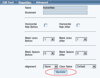
All components have a tab option called "Properties". The properties of the component allow you to change the name, bookmark, horizontal lines before and after, blank lines before and after, blank spaces before and after, alignment, and a class.
-
Name:specify a name of the component to identify this component
from other components. The component name does not appear anywhere on the
Web page itself and is only used to help you identify components.
Bookmark: specify a bookmark for this component so that you may link to this exact location on the page from another Web page. For example, let's say you bookmarked an image and the bookmark name is "my new bookmark" (without the double quotes), when you link to this exact location, the URL would be "#my new bookmark" (without the double quotes).
Horizontal Rule Before: allows you to specify whether you want to place a horizontal line before this component.
Horizontal Rule After: allows you to specify whether you want to place a horizontal line after this component.
Blank Lines Before: allows you to specify where you want a blank line before this component.
Blank Lines After: allows you to specify where you want a blank line after this component.
Blank Spaces Before: allows you to specify where you want a blank space before this component.
Blank Spaces After: allows you to specify where you want a blank space after this component.
Alignment: allows you to specify a general alignment to apply to the component. Rich Text components do not have this setting under Properties.
Class Name: if you are using a stylesheet and have specified a class for this component, you may select the class that will apply to this component. Only Standard and Container components can have a class applied to them; Other components cannot have a class applied to them. Rich Text components have an additional option to have the class settings override settings from the main Edit Rich Text window. For more information about styles and classes, please see Working with Classes and Stylesheets.
When you are done making your changes, you must click on the button "Update" to apply your changes to the component.
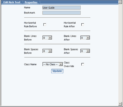
Rich Text Properties
The Rich Text component has many of the same options in its Properties menu, but there are two small differences. Alignment is not a setting in Properties for Rich Text because you set it in the main Edit Rich Text screen. There is also a new setting unique to Rich Text:
- Class Override: when checked, allows any font or text settings in an applied class take precedence over conflicting settings from the Edit Rich Text menu.
Back to the Top of the Page
Back to the Previous Page
Select Colors
Any time you see a dashed square next to the text "No Color", click on
the dashed square to select a color. If you already have selected a color,
the square will be in the color that you last specified.
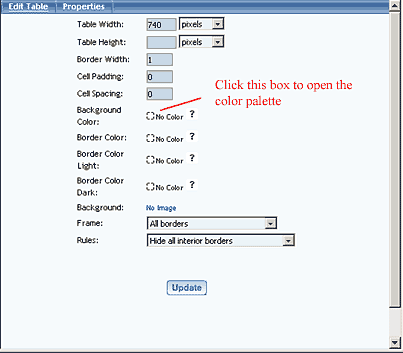
After you have clicked on the colored square, a color palette will appear.
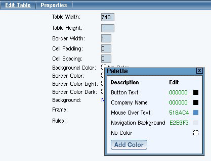
Click on a colored square in the color palette to use that color. To add
a new color, click on the button "Add Color". To edit the color for an existing
color label, click on the 6 digit alpha-numeric color code.
Click here for more information on the color
palette.
Back to the Top of the Page
Selecting a Color in the Rich Text Component
Choosing a color while working in the Rich Text component is much the same as selecting a color in other areas of the editor.
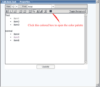
Begin by highlighting the text you would like to change, then click the colored box near the top of the window. The color palette will appear.
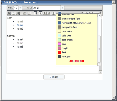
Click the colored box for the color you want, and it will be applied to the highlighted text. To add a new color, click on the link "Add Color". The window for adding a color to the palette will appear.
Back to the Top of the Page
Back to the Previous Page
Select an Image
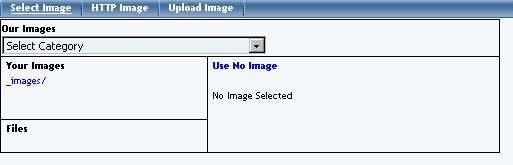
When you click on the button "Select" to select an image for the image component, the Page Editor opens up a new window. The three white text options allow you to select an image from your directory or the image library, an image from the Internet, and to upload a new image file. Click on the section that best identifies where your image is located. The Page Editor recognizes BMP, JPG, GIF, and PNG file formats.
Select an Image from your Image Directory
Select an Image from the Web
Upload an Image from your Computer
Select Image
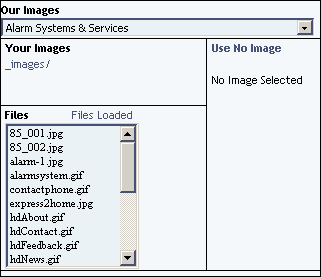
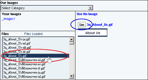
If the image you want to use is in our royalty-free library of images, select a business category to browse through in the drop-down menu next to the text "Our Images".
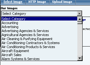
Once you have chosen a category, the Image Selector will reload and display the files of the business category in the section called "Files".
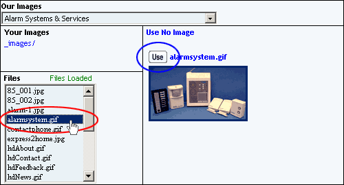
Click on the filename of an image to see a small preview on the right side. If this is the image that you would like to use, click on the button "Use".
If the image you want to use is in your images folder, click on the directory name of "_images/" of your images folder.
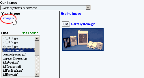
Click on the filename of an image to see a small preview on the right side. If this is the image that you would like to use, click on the button "Use".
Back to the Top of Select an Image
Back to the Top of the Page
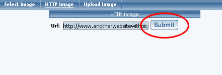
HTTP Image
Specify the exact Web address of the image file that you want to use for this image component. For example, if the image you want to use is "jumbotext.gif" in the images directory of the Web site "www.anotherwebsitewithpictures.com", then you would need to input "http://www.anotherwebsitewithpictures.com/images/jumbotext.gif" (without the quotes) in the field "Url". When done, click on the button "Submit".
Back to the Top of Select
an Image
Back to the Top of the Page
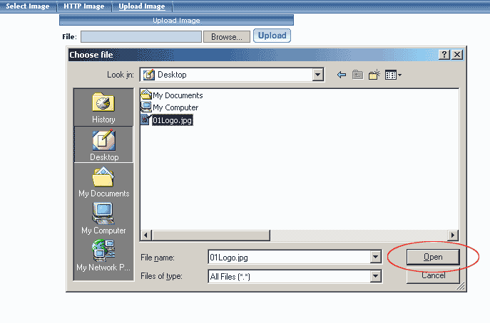
Upload Image
Click on the button "Browse" to locate and select the file that you would
like to upload. A dialog box allowing you to browse through your computer
will be opened. Navigate through your computer folders to locate your file.
Once you can see your file, click on the name of the file and click on the
button "Open". Click on the button "Upload" to upload the image to your File
Cabinet as well as select the image file for use with the image component.
Back to the Top of Select
an Image
Back to the Top of the Page
Component Types
There are three categories of components. Standard, Container, and Other.
-
Standard Components
-
Image - This option allows you to add an image
or picture to the Web page.
Text - This option allows you to add text to the Web page. Ideally, you would have one text component for every paragraph of text.
Literal - This option allows you to add HTML or Javascript code to the Web page.
Back to the Top of the Page
Container Components
-
Table - The Table Component serves as a container
for other components. You can even add tables to a table component. Ideally,
you should start your page with a table component so that you position your
components with ease.
Form - The Form Component serves as a container for other components. A form component is largely identified as a table component, but has unique options to add form input components. Such form input components include: button, checkbox, password, radio, select, textbox, and textarea. Once you have created your form, you must create and designate a form processor that will handle the form information that visitors will fill out.
List - The List Component serves as a container for other components. Once you add a list item component (a bullet), you will be able to add other components. Each list item component will have a bullet preceding the component.
Back to the Top of the Page
Ecommerce Components
-
Catalog - Before a product catalog can
be viewed on a Web site, a catalog page must be added. If you will allow
customers to purchase from your Web site, you will also need a cart component.
Cart - Before products can be purchased from a Web site, a shopping cart page must be added (see adding a new page for details). The cart component is used in conjunction with a catalog component.
Item, Item Group, Package - give Web site visitors the ability to add a specific product to their shopping cart.
Back to the Top of the Page
Other Components
-
Map - Map Components will display a map on the
Web page that will allow visitors to zoom out and in around the address
that you specify.
Flash - Flash Components allow you to add Flash animation to your Web page. You may use one of our Flash templates or you may use your own custom Flash file (SWF or SWT).
Navigation - To add a menu navigation for all of your pages, you would use a Navigation component.
Stock Quote - For your Web page, you can add a stock quote component that will list up-to-date information regarding the stock symbol that you specify.
Calendar - add a calendar to your Web page to allow visitors to see, modify, and add appointments to the calendar. You would manage the calendars using the Calendar Manager.
Weather Forecast - A Weather Forecast component will display the weather information for a particular zip code.
Search - To allow your Website visitors to search your entire Web site, you must add a Search Component. You must also add a Search Result Component to a Web page and you must also create a database of your site by the Rebuild Search Engine Tool.
Search Result - To allow your Web site visitors to search your entire Web site, you must add a Search Component, a Search Result Component, and you must also create a database of your site by the Rebuild Search Engine Tool.
component is used in conjunction with a catalog component.
Language Translator - This component will add flags of different countries whose languages that your Web site has been translated in to. When a customer clicks on the flags, your entire Web site will be translated in to the national lanugage of that country.
Calculator - add a number of specialized calculators (such as Body Mass, Budget Percent, Retirement Savings, Savings Goal, and Single Deposit Savings, to name but a few) to your Web site easily without having to know the code for it.
Back to the Previous Page