Container Component
Form
Related Links: How to Add a Component | How to Modify a Component | Editing BasicsOverview | Edit Form | Required Fields | Modify the Form | Form Input Components
Overview
The Form Component serves as a container for other components. A form component is largely identified as a table component, but has unique options to add form input components. Such form input components include: button, checkbox, password, radio, select, textbox, and textarea.
Click on "Page" in the top-left corner of the Page Editor. Click on "Container". Click on "Form".
Once you have created your form, you must designate a form processor that will handle the form information that visitors will fill out. If the form uses a form processor from our system, you can view the visitor's form information using the Form Processor Browser. If you use your own custom form processor, you will already have your own way to view the visitor's form information.
If you wish to designate this form component to send information to the Contact Manager, please click here for more information.
When you are building your form, please keep in mind that you should not add other container components (such as form components, table components, or list components) to the form. Use the form component's ability to add rows or columns in order to achieve your formatting/alignment ideas. Also, the order in which you place your form input components is the order in which the information will be sent to you via e-mail and via the Form Processor Browser.
Back to Overview
Back to the Top of the Page
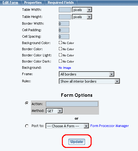
Edit Form
You can specify the form width, form height, border width, cell padding and cell spacing for the form. Cell padding is the area around the contents of the cell. Cell spacing is the area around the cell itself.
You can change the colors of the form with respect to the background, border, light border, and dark border. The Background Color will specify a color inside the form itself whereas the Border Color will specify a color for the outline of the form. If you specify a Border Color Light or Border Color Dark, these colors will override the Border Color. Border Color Light and Border Color Dark add color shading to the form. All of the border colors will only show up if the Border Width is a number larger than zero (0).
The Background Image will apply a background image to the form itself. The Background Image will be applied in front of the Background Color, so only one can be used at the same time. If your form is larger than the Background Image, the Background Image will be repeated so that the background of the form is completely using the Background Image.
The Frame and Rules options allow you customize the look of the border for the form. The Frame option allows you to "Hide borders", "All borders" (this option is also the default), "Border on top edge", "Border on bottom edge", "Border on top and bottom edges", "Border on left edge", "Border on right edge", and "Border on left and right edges". The Rules option allows you to "Hide all interior borders", "Show all interior borders" (this option is also the default)", "Show borders between columns only", and "Show borders between rows only".
For the section "Form Options", you can choose to select to manually specify the form's Action and Method fields or specify the form processor that will handle the form when the form gets submitted. If you know the Action and Method, select the first radio button and fill out your information. If you set up a form processor using the Form Processor Manager, select the second radio button, then select your form processor in the drop-down menu.
When you are done modifying the options for the form component, click on the button "Update" to save and apply your changes to the Web page.
Back to Edit Form
Back to the Top of the Page
Required Fields
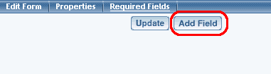
Some times, you may need to specify certain form input fields as required. Click on the tab "Required Fields" in the form editing window. You will see the following screen:
Specify the exact field name of the form input component that you would like to have as required. The field name of the form input component must be put in the text field next to the text "Field Name". This must be exactly the same - for example, if the field name of the form input component is "first_name", only "first_name" would be correct.
For the drop-down menu "Valid Input", specify the type of characters that the system should be expecting from this form input component.
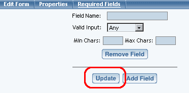
Specify "Any" if the form input component accepts any type of character (letter or number) as input. Specify "Character" if the form input component should only accept letters (alphabet). Specify "Integer" if the form input component should only accept whole numbers - for example, "123" and "456" are valid but "12.34" is not. Specify "Number" if the form input component accepts numbers only - for example, "12345.00" and "123456" are valid.
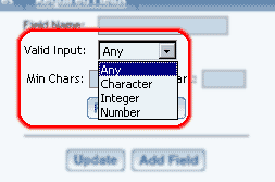
Both the "Min Chars" and "Max Chars" fields are mandatory in order to require Web site visitors to fill out this field. Specify the minimum number of characters that the form input component will allow in the field "Min Chars" and the maximum number of characters in the field "Max Chars".
When done, you must click on the button "Update" to save your changes. To apply your changes to the Web site, you must Publish.
Back to the Top of the Page
Modifying Elements in the Form Component
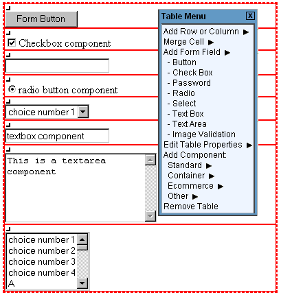
To add form input components to the form, click on the editing square in the top left corner of any form cell. When the menu appears, click on "Add Form Input Component". You have options to select the type of form input components to add.
Back to Modify Form
Back to the Top of the Page
Form Input Components
Form input components include: button, checkbox, password, radio, select, textbox, and textarea. Once you have created your form, you must create and designate a form processor that will handle the form information that visitors will fill out. Click here for more information on Form Input Components.
Editing Basics
Back to the Previous Page